HUAT LIM & SUSANNE ZEIDLER
ZLG DESIGN
In the early days of ZLG, Huat and Susanne were laying out the underlying principles and philosophies to what later became their approach to design in architecture; what they intended was to go beyond the already-discovered territories of architecture in pursuit of something that was (at that time), in the realms of the unknown. Since then, ZLG’s mission is to pave the way for architecture that possess an ‘awe’ element; much like, how people react to good art and music.
“We think that it is possible for us to connect to our buildings as easily as we can connect to art, or to our music, or to things that we adore, like our children or our books”.
In ZLG, architecture is not about adhering or conforming to a certain style or winning ‘beauty’ contests (or at least not the primary premise). For in their methodologies, architecture begins with an idea and philosophy rather than just an aesthetic goal to aim towards to. The process is a means to create something new, unique and specific in service of people, invoking emotion so people can interact and enjoy the intricacies imbued in beautiful architecture.
“If it doesn’t engage or connect with one’s emotion, or if it’s just not involving enough, we’ll probably just throw it out the window. We won’t want to take that thing all the way to the end…If it’s not intriguing enough and doesn’t hold any mystery or surprises then I guess it really isn’t worth developing…the drama isn’t going to be there by the time one is finished with it, not enough to sustain the experience”, says Huat.
Point 92
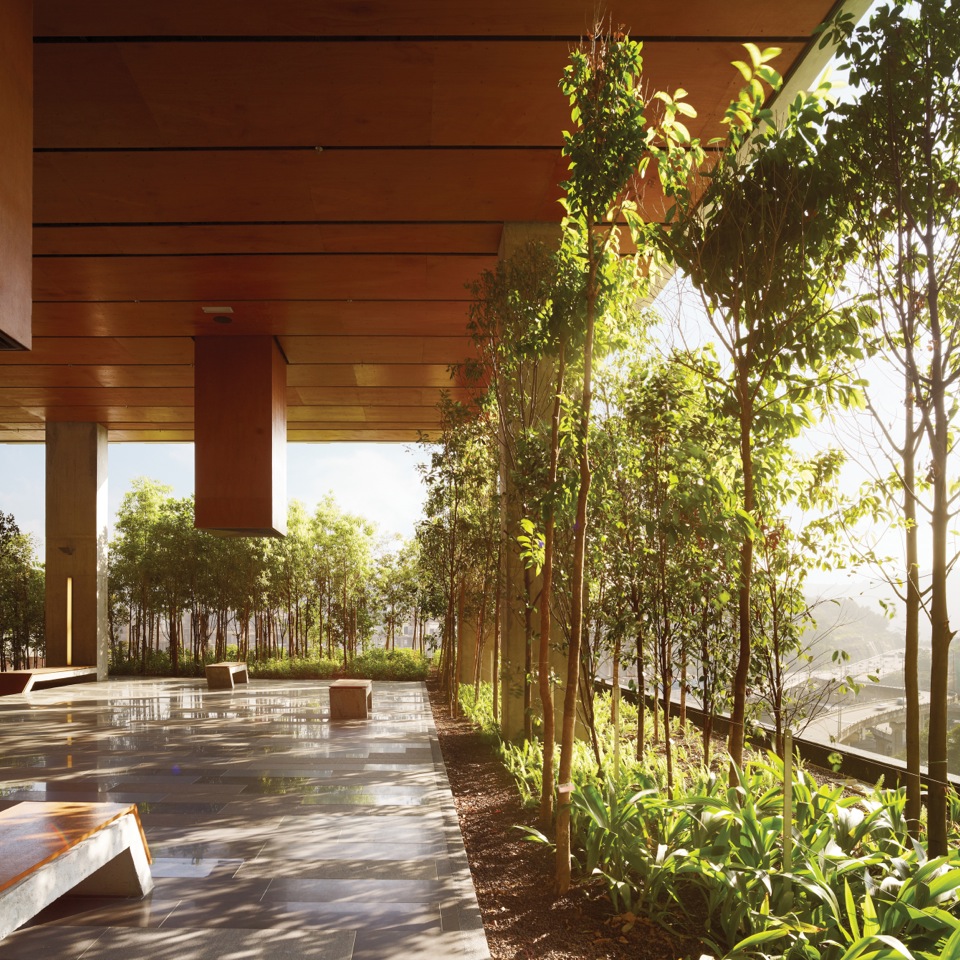
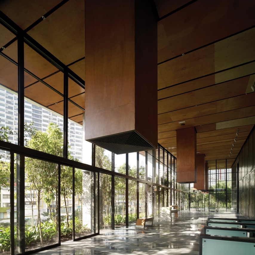
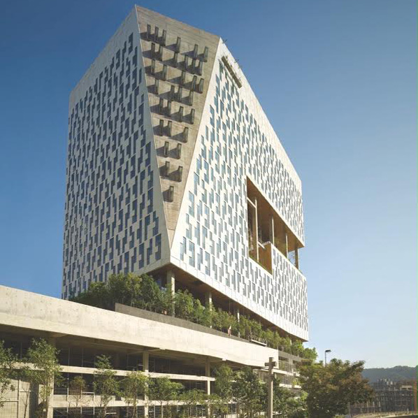
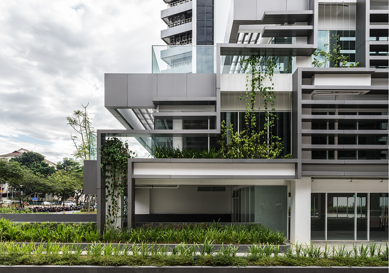
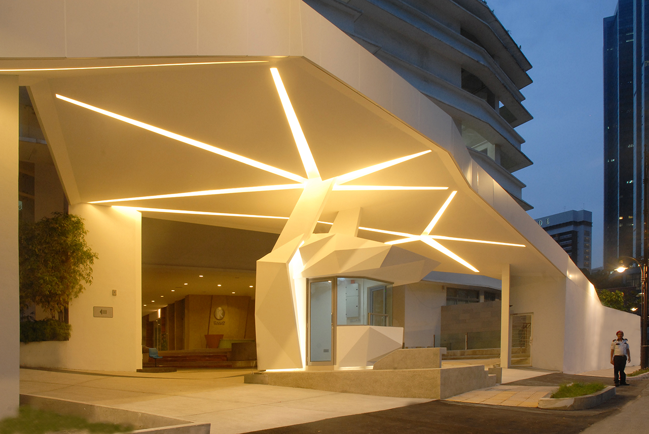
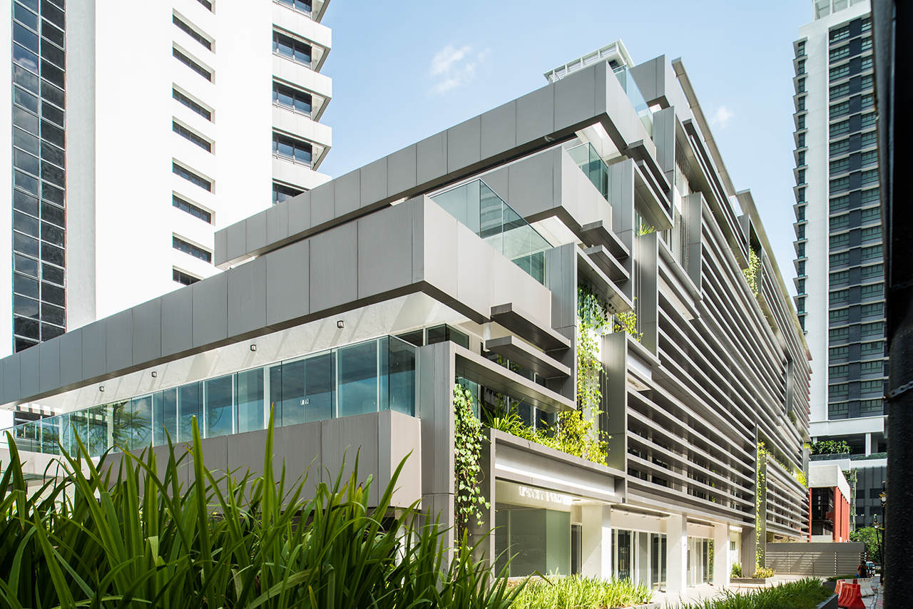
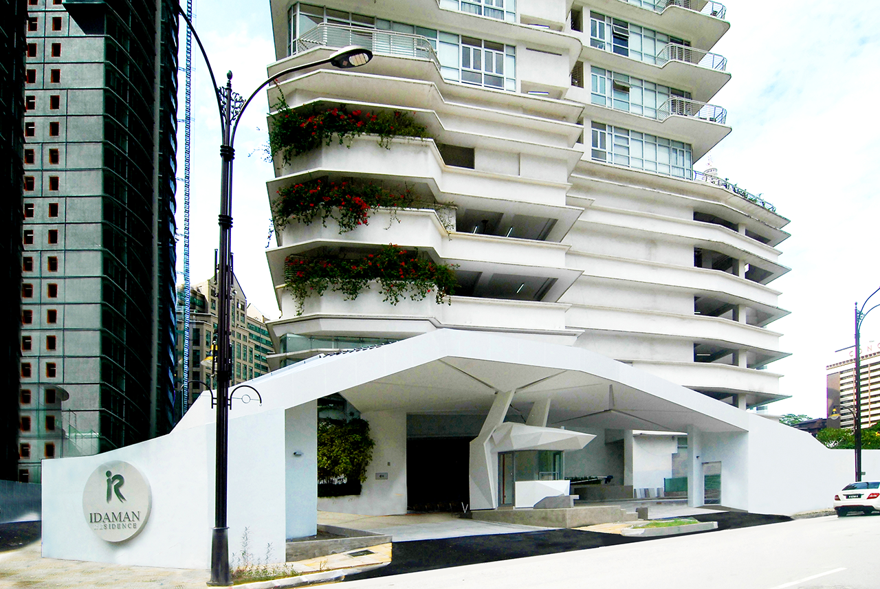
Which brings us on appropriately to Point 92 that articulates this philosophy beautifully. Staying true to their intention of creating an ambience, visitors will get to experience a breathtaking view of Damansara Perdana as they arrive at the lobby through a gradual escalating step way above the drop-off. It is here that the viewer finds the opportunity to fully drink in the view by intuitively placing precast concrete benches that encourage respite, while wooden lanterns with marine plywood ceilings buttoned tightly against a raw concrete undercroft creating a soothing canopy.
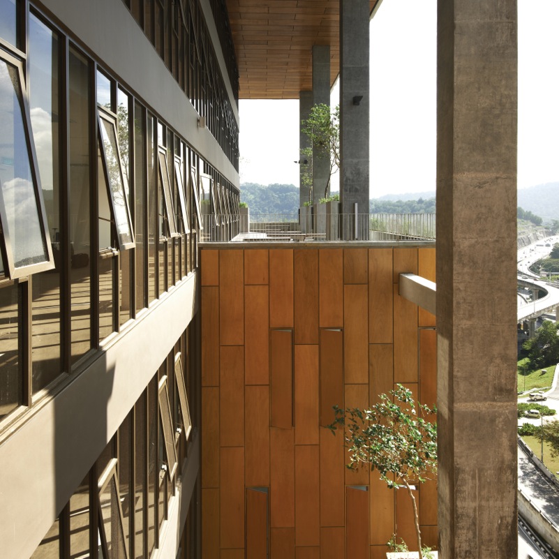
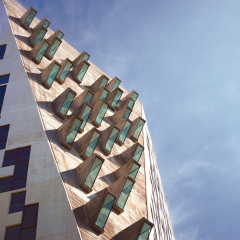
Point 92 is also one of the first major speculative office building that has utilised a concrete façade. In terms of phenomenology then, it is arguably the first building to give back open space to the public realm, reducing social ills related to workplaces in high-density areas, and in complementing public buildings as a whole. Point 92 engages the viewer and invokes a sense of external awareness; the viewer apprehends a sense of arrival demarcated at the ramps; a sense of place is associated with the unique façade design and good orientation.
The viewer navigates simultaneously in an existential manner through the premise seamlessly, and without angst credit to the visitor’s a priori knowledge in reading architectural cues rather than relying on the necessity for signs. The viewer enjoys a pleasant sense of connectivity as the open breezeway opens the door to engagement with nature. A sense of landscape at level 7 and 9 and a sense to emancipation can be found by opening any of the Malaysian-style lanai windows placed on the elevations.
Lantern Hotel
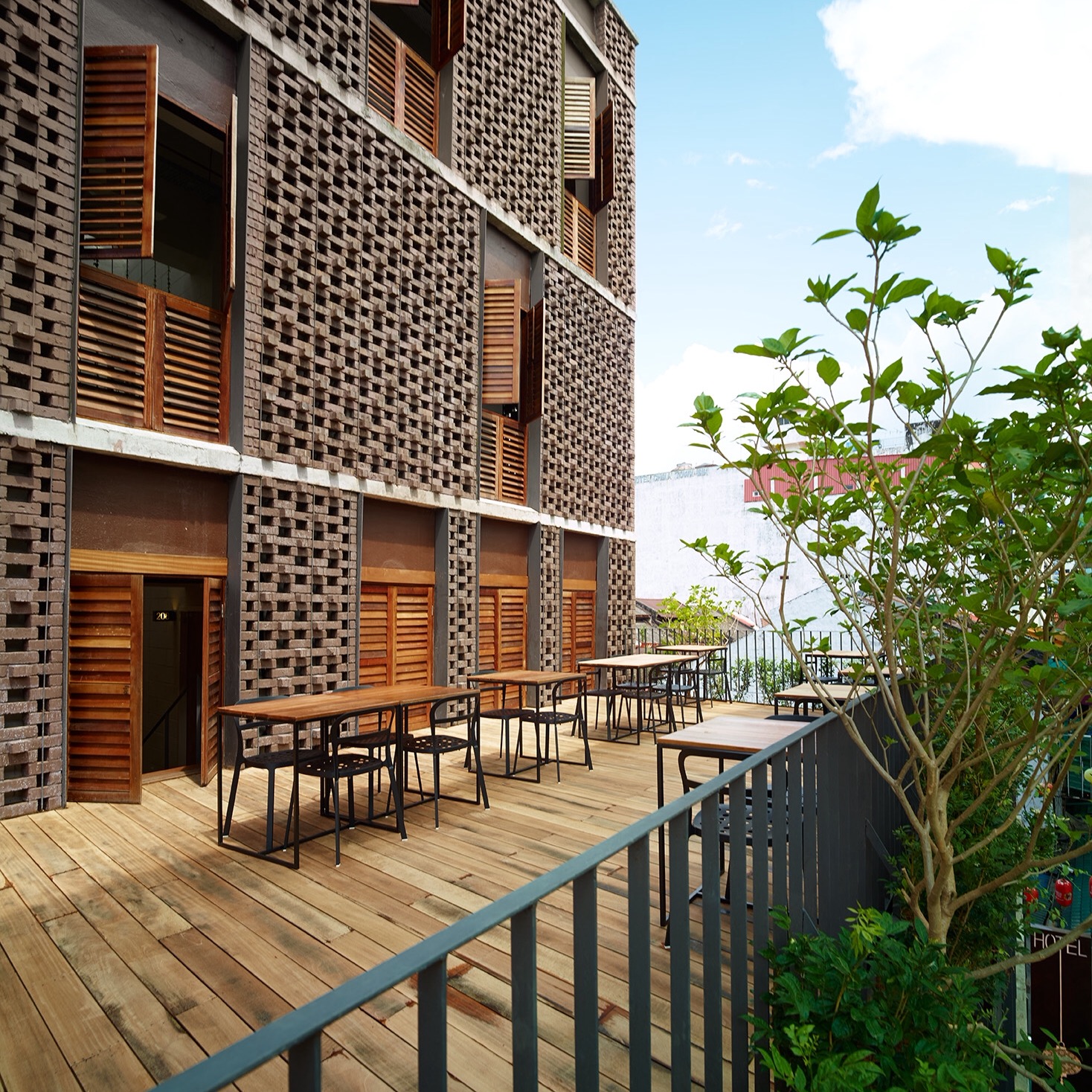
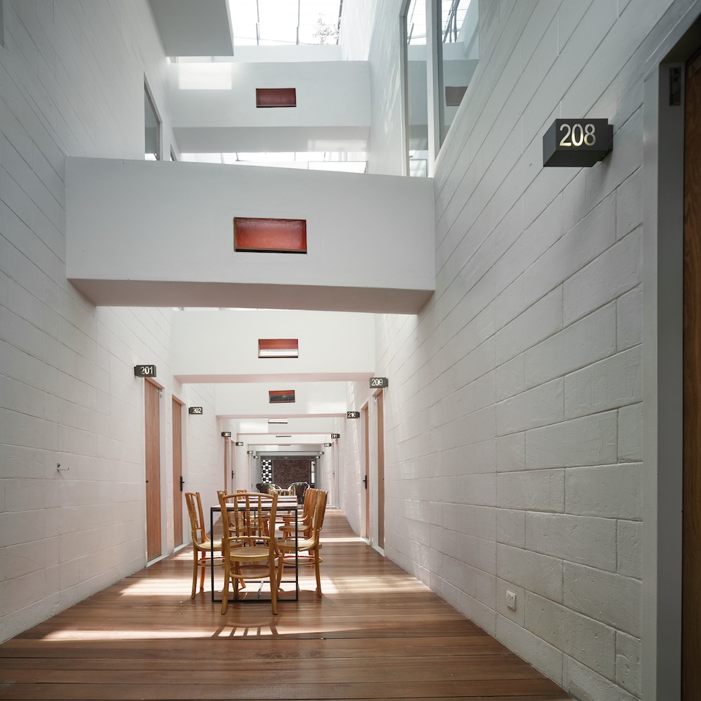
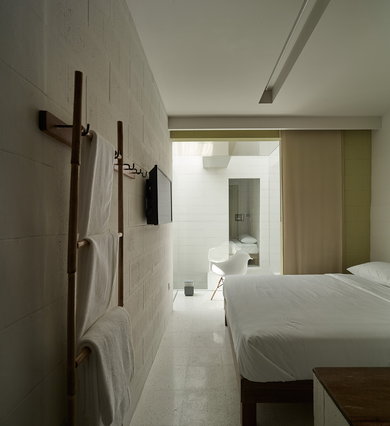
Painstakingly designed with a tight budget and with less than ideal circumstances, the four-storey hotel comprises of 49 hotel rooms with attached bathrooms, breakfast facilities, a centralised computer area, a locker area as well as an outdoor terrace; all-in at only RM4.2million, including furnishing.
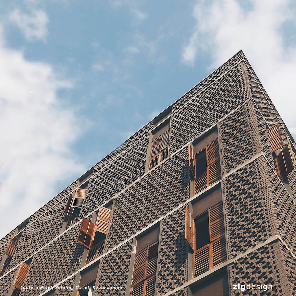
The challenge included on overcoming the problem of the existing building mass and the client’s brief on maximising the space with as many rooms as possible at the lowest budget possible; while creating a comfortable hotel that engages with its historical heritage, namely Petaling Street, “in the most sensitive and empathic way possible”, says ZLG Design.
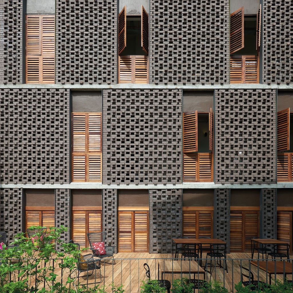
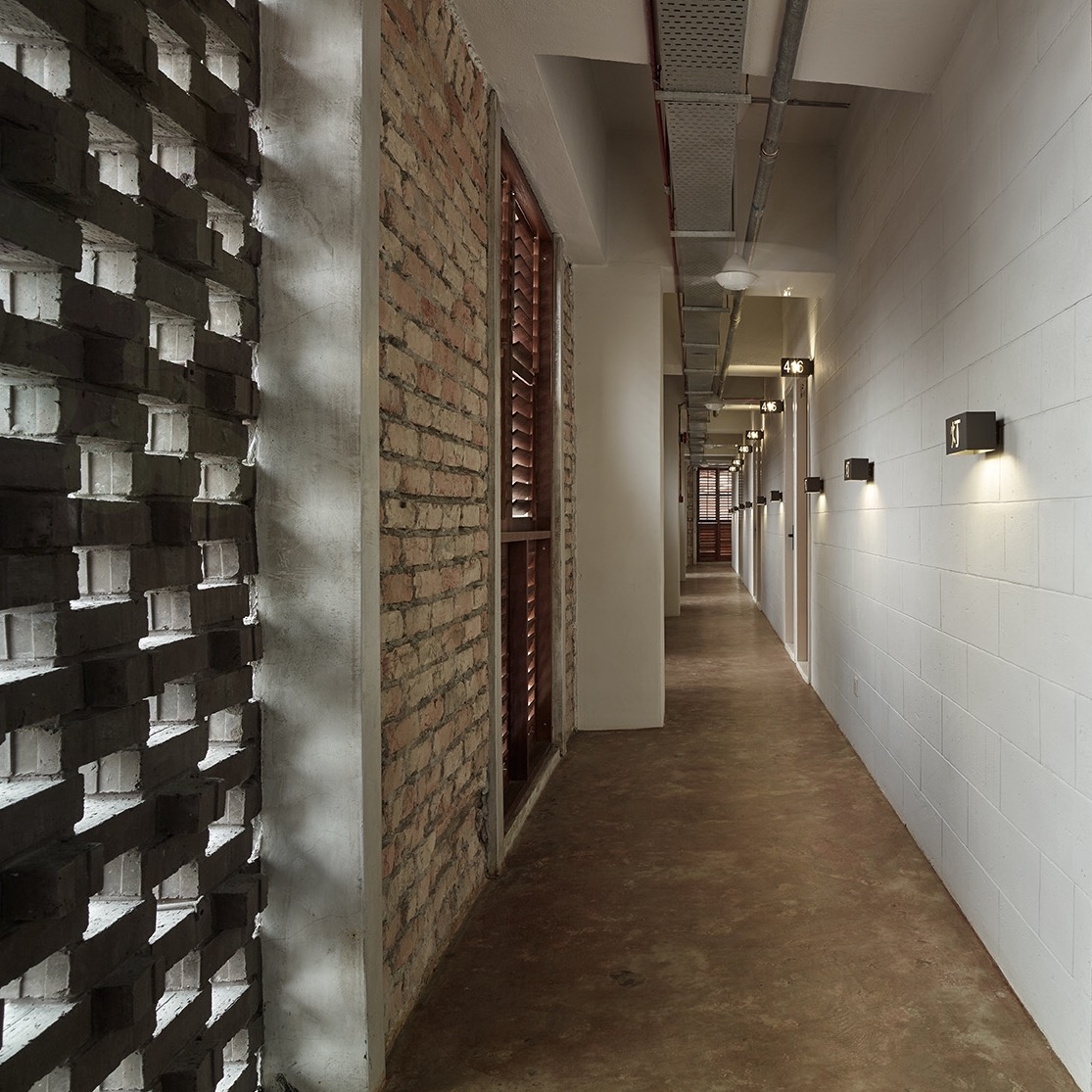
The façade was designed to be less obtrusive and to blend in harmoniously with the hustle and bustle of the historical road. Locally manufactured, dark brown clay bricks from Johor Bahru were used. Several laying methods were studied to arrive at the final form that would allow for sufficient openings as well as provide the façade with a three-dimensional texture.

KEN YEANG
Curriculum Vitae
Ken Yeang is an architect, planner, and ecologist who is best known for his signature green architecture and master planning, differentiated from other green architects by his authentic ecolology-based approach, by their distinctive green aesthetics and performance beyond conventional systems. He trained at the AA (Architectural Association,UK) and received his doctorate from Cambridge (UK) on ecological design and planning, His key buildings include Solaris (Singapore), Menara Mesiniaga (Malaysia), Spire Edge Tower (India), Genome Research Building (Hong Kong), Great Ormond Street Children's Hospital Extension (UK).
He is the Principal of T.R. Hamzah & Yeang with offices in Malaysia, UK, and China. He is a recipient of the Malaysia Institute of Architects Gold Medal, the Government of Malaysia Merdeka Award and the Architectural Society of China Liang SiCheng Award 2016.
The UK Guardian newspaper named him as one of 50 individuals who could save the planet and named by CNN as the leading architect in ecological design.
Concept and Design
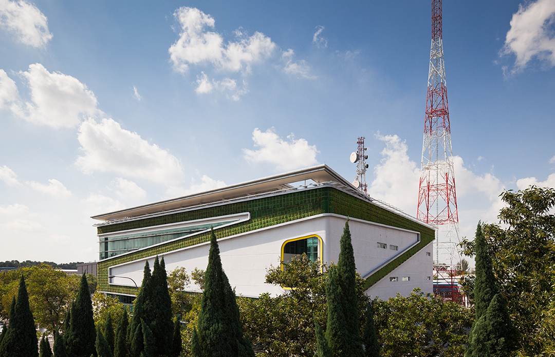
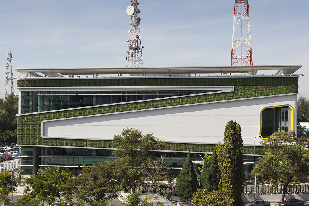
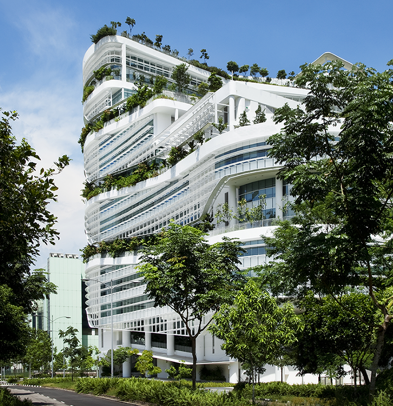
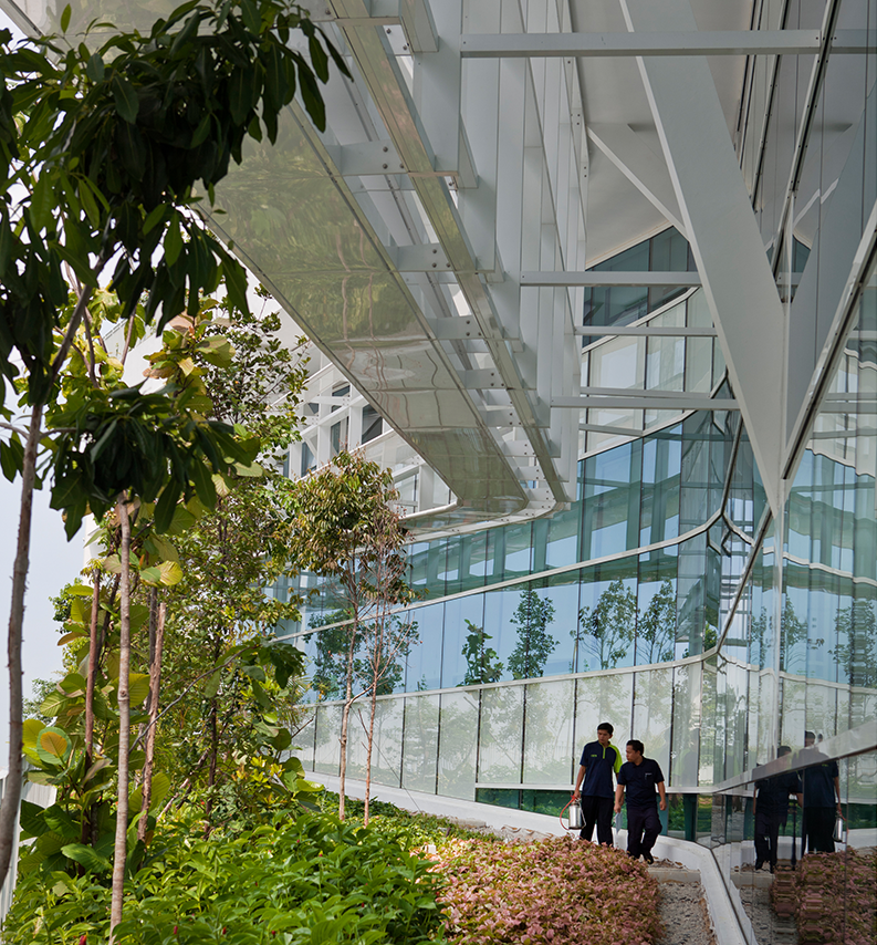
In the tropics especially, high-rises are traditionally the most unecological of all buildings, often wasting up to 30% more energy than lower structures built with the same materials. Yeang uses walls of plants, photovoltaics, scallop-shaped sunshades, advanced ventilation and whatever he can to collect water and breezes.
The idea is to make buildings run as complete ecosystems with little external energy supply. He's not there yet, but the possibility of the green skyscraper is developing fast as ecological imperatives filter into the consciousness of the startlingly backward world of international architecture.


